 The website TutorialsWeb.com has undergone a major update towards fully responsive site. A fully responsive site, also called Mobile First, provides uniform appearance on mobile as well as desktop devices.
The website uses HTML5, CSS3, Media Query, and JQuery for coding and breadcrumbs aided navigation for better user experience. Typical screen shots for various devices are given below:
 The mobile version of the site consists of the same menu items as that of the desktop site, but customized to the mobile device. The menu is user friend and the web page contents are readily accessible with just scrolling vertically.
As may be seen, the first level menu consists of Certification Notes, Electronic Assembly, Satellite Communications, Computers & Networks, RF Test & Meas, and Software. On clicking the first level menus, a user would be presented with second level menu as shown in the figure below:
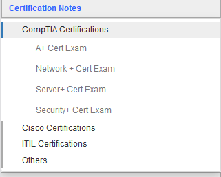
 For example, the Main Menu tab Certification Notes has four Sub-Menu items, namely, Comptia Certificaiton, Cisco Certifications, ITIL Certifications, and Others. By clicking on respective sub-menu item, one would be taken to the third-level menu link or to the corresponding web page as applicable. In this particular case, third level menu item is presented as shown in the figure below:
 The third level menu items consist of A+ Cert Exam, Network+ Cert Exam, Server+ Cert Exam, and Security+ Cert Exam. On clicking the hyperlink, one will be taken to the respective web page as shown below:

As may be seen in the figure to the right, the web page consists of navigation bread crumbs giving the path to the current page. In this example, it is Certification Notes > A+ Cert Exam > A+ Essentials Cram Notes (An ad appearing below that and followed by the notes).
The website has been thoroughly updated and reviewed for design and visual interface so that web pages are rendered properly in all possible mobile and desktop devices.
Please email us the feedback if you find any bugs or suggest any improvements.

